2026
The Art of Scene Composition in Visual Narratives
*Last updated: March 2026 | Reading time: 19 minutes*
A perfectly composed frame does more than please the eye — it guides attention, evokes emotion, and advances story without uttering a single word. Scene composition is the invisible force that makes audiences lean forward during tense moments, feel claustrophobic in tight spaces, or experience the vastness of epic landscapes. It's the difference between a forgettable shot and an iconic image that defines a generation of visual media.
Yet composition remains one of the most misunderstood aspects of visual storytelling. Many creators treat it as an aesthetic afterthought, something to "make look good" after the important decisions are made. This fundamental misunderstanding leads to visually chaotic narratives that exhaust audiences, muddle messages, and undermine even the strongest scripts. The truth is that composition IS storytelling—every choice about what to include, exclude, and emphasize shapes meaning as powerfully as any dialogue.
This guide deconstructs the principles of masterful scene composition, from the mathematical precision of the golden ratio to the emotional impact of broken symmetry. You'll learn how Christopher Nolan uses composition to bend time perception, how Wes Anderson's symmetrical frames create otherworldly charm, and how horror directors weaponize negative space to build unbearable tension. More importantly, you'll understand the why behind these choices, enabling you to develop your own compositional voice.
Whether you're storyboarding your first short film, designing game environments, or creating social media content that stops the scroll, mastering composition transforms you from someone who captures images to someone who crafts experiences. This isn't about following rules—it's about understanding visual psychology deeply enough to know when and why to break them.
### Table of Contents
1. **The Psychology of Visual Perception**
- How the eye travels through a frame
- Cognitive processing and visual hierarchy
- Cultural reading patterns and global audiences
- Attention, retention, and emotional response
2. **Fundamental Composition Principles**
- Rule of thirds and when to break it
- Golden ratio and fibonacci sequences in nature
- Leading lines and directional force
- Symmetry, asymmetry, and dynamic balance
3. **Depth and Dimension**
- Foreground, middle ground, background relationships
- Overlapping and size variation
- Atmospheric perspective and color depth
- Z-axis storytelling in 2D frames
4. **The Power of Negative Space**
- Isolation and emotional distance
- Building tension through emptiness
- Breathing room and pacing control
- Minimalism as narrative device
5. **Framing and Boundaries**
- Natural frames within frames
- Claustrophobia and expansion techniques
- Breaking the fourth wall compositionally
- Edge tension and border psychology
6. **Movement and Direction**
- Static composition suggesting motion
- Directional momentum and story flow
- Diagonal dynamics vs. horizontal calm
- Circular composition and eternal loops
7. **Color as Compositional Tool**
- Color weight and balance
- Contrast and focal points
- Complementary schemes for tension
- Monochrome for form emphasis
8. **Lighting and Shadow Composition**
- Chiaroscuro and dramatic emphasis
- Rim lighting for separation
- Shadow as compositional element
- Time of day and emotional tone
9. **Character Positioning and Relationships**
- Power dynamics through elevation
- Distance as emotional metaphor
- Group compositions and social hierarchy
- Single character psychological states
10. **Genre-Specific Composition**
- Horror: Weaponizing the unseen
- Romance: Intimate space design
- Action: Kinetic energy and chaos control
- Comedy: Visual gag setup and payoff
11. **Composition for Different Formats**
- Theatrical widescreen considerations
- Mobile-first vertical video
- Social media square format
- Multi-screen and installation work
12. **Advanced Compositional Techniques**
- Rack focus implications for composition
- Composite layering and VFX integration
- Breaking conventional aspect ratios
- Transitional composition between scenes
13. **Analysis of Master Composers**
- Akira Kurosawa's geometric precision
- Terrence Malick's natural flow
- Denis Villeneuve's architectural frames
- Ari Aster's symmetrical horror
14. **Practical Exercises**
- Daily composition studies
- Thumbnail exploration techniques
- Composition correction workshops
- Building your compositional vocabulary
15. **From Storyboard to Final Frame**
- Maintaining compositional intent through production
- Working with cinematographers
- Adapting to location limitations
- Post-production reframing options
The Psychology of Visual Perception
Before a single compositional rule can be applied, it helps to understand why composition works at all — and that means understanding how the human visual system processes images.
How the Eye Travels Through a Frame
Vision is not passive. The eye doesn't scan a frame randomly — it follows predictable paths determined by contrast, brightness, edges, and focal depth. High-contrast areas and sharp edges attract attention first. From there, the eye moves along leading lines, follows implied direction, and settles on the primary subject. Understanding this path lets a compositor choreograph exactly where a viewer looks, and in what order — turning the frame itself into a form of direction.
Cognitive Processing and Visual Hierarchy
The brain processes visual information in two stages. Pre-attentive processing happens in milliseconds — color, motion, and sharp contrast pop before conscious thought kicks in. Attentive processing follows, building meaning from the relationships between elements. A well-constructed frame uses this sequence deliberately: the pre-attentive layer draws the eye to the right place, and the attentive layer rewards sustained looking with depth and narrative detail. Visual hierarchy is the practice of aligning your compositional choices with this cognitive order.
Cultural Reading Patterns and Global Audiences
Not all viewers read a frame the same way. Western audiences typically scan left-to-right in a Z or F pattern, a habit carried over from reading text. Many East Asian visual traditions favor right-to-left entry points. Arabic and Hebrew speakers often reverse the Western scan entirely. These aren't rigid rules, but they represent tendencies strong enough to affect where a composition feels natural versus where it creates friction. For work aimed at a global audience, understanding these patterns allows a director to design frames that feel intentional everywhere — or to use cultural friction deliberately as a storytelling device.
Attention, Retention, and Emotional Response
Composition doesn't just guide the eye — it shapes what stays in memory and how a scene makes someone feel. Studies in visual cognition show that emotionally congruent compositions — where the spatial arrangement reinforces the emotional content — are retained significantly longer than compositions that contradict it. A character framed small against an overwhelming environment is remembered as vulnerable. The same character centered and dominant is remembered as powerful. This means every compositional choice is also a memory and emotion engineering decision, not merely an aesthetic one.
Fundamental Composition Principles
Understanding visual psychology tells you how viewers see. Composition principles tell you what to do about it. These aren't arbitrary rules invented by art schools — they are patterns extracted from centuries of painting, photography, and cinema that reliably produce intended visual effects. Knowing when to apply them is craft. Knowing when to break them is artistry.
Rule of Thirds — and When to Break It
Divide the frame into a 3×3 grid and you get four intersection points — the power points where the eye naturally rests. Placing your primary subject at one of these intersections, rather than dead center, creates tension and dynamism that feels natural without announcing itself. A subject slightly off-center reads as purposeful; a subject hard against a grid line creates directional pull toward the empty space. The rule of thirds is not about always following the grid — it is about understanding which visual weight it produces so you can deploy it, or deliberately contradict it, with intention. Dead-center framing, when used selectively, signals power, stillness, or confrontation. Knowing the rule is what makes the break meaningful.
The Golden Ratio and Fibonacci Sequences in Nature
The golden ratio — approximately 1:1.618 — appears throughout nature in the spiral of a nautilus shell, the branching of trees, the arrangement of seeds in a sunflower. The Fibonacci sequence (1, 1, 2, 3, 5, 8, 13…) generates this ratio as it grows, and the logarithmic spiral it produces maps onto compositional space in a way the eye finds inherently satisfying. The golden spiral places the tightest point of focus — the eye of the spiral — at a location slightly more refined than a rule-of-thirds intersection, pulling the viewer on a curved path through the frame before settling on the subject. It is more effortful to construct than thirds but tends to produce images that feel organically balanced rather than mechanically divided. For storyboard work, even a loose awareness of spiral flow can inform how you position subjects relative to background elements without needing to calculate the ratio precisely.
Leading Lines and Directional Force
Any line in a frame — a road receding to the horizon, the edge of a table, a character's outstretched arm, a shaft of light — has directional force. It pulls the eye along its length and deposits attention wherever it terminates. Leading lines are one of the most powerful tools a compositor has because they work pre-attentively: the viewer follows them before consciously deciding to. Converging lines (like railroad tracks meeting at a vanishing point) create depth and urgency simultaneously. Diagonal lines carry energy and instability. Horizontal lines read as calm or static. Vertical lines suggest strength or confinement depending on context. The practical skill is learning to see these lines in your scene elements — architecture, furniture, terrain, light — and then staging your subjects so that the lines lead toward them rather than away.
Symmetry, Asymmetry, and Dynamic Balance
A perfectly symmetrical frame — mirrored left and right, or top and bottom — creates formality, grandeur, or unease depending on its emotional context. Wes Anderson built a visual identity from near-perfect symmetry; Stanley Kubrick used it to make institutional spaces feel inhuman and inescapable. But symmetry is a high-commitment choice. Pure symmetry demands that every element in the frame participate in the mirror — a single misaligned detail breaks the effect and reads as a mistake rather than a choice. Asymmetry is more flexible and more naturalistic. A frame is asymmetrically balanced when the visual weights on either side of the center axis feel equivalent without being identical — a large dim object balanced against a small bright one, or a cluster of small elements counterweighting a single large form. Dynamic balance, the most sophisticated version, uses color, contrast, texture, and implied movement to keep a fundamentally uneven frame from feeling lopsided. It is harder to achieve than either pure symmetry or simple asymmetry, but produces images that reward extended looking.
Depth and Dimension
A flat frame and a deep frame can contain identical subjects yet communicate entirely different stories. Depth isn't a photographic accident — it's a compositional decision that determines how immersive, expansive, or intimate a scene feels. Managing the three-dimensional illusion within a two-dimensional frame is one of the most powerful tools available to a visual storyteller.
Foreground, Middle Ground, Background Relationships
Every frame has the potential to be read in three layers. The foreground anchors the viewer in the scene — a branch, a railing, a shoulder — and creates the sense that the world extends forward beyond the frame's edge. The middle ground is where primary action typically lives; it's the zone the eye naturally settles into after being drawn through the foreground. The background establishes context: environment, scale, atmosphere, world. Deliberately composing all three layers into a single frame creates scenes that feel inhabited rather than staged. Leaving one layer empty is also a choice — a figure against a featureless background isolates; a figure in a layered environment embeds.
Overlapping and Size Variation
When objects overlap, the eye reads the covering object as closer. When objects of known similar size appear at different scales, the smaller reads as farther away. These two cues — occlusion and relative scale — are among the most primitive depth signals the visual system uses, predating learned perspective conventions. A storyboard artist who places a large element in the foreground overlapping a smaller element in the middle ground creates depth without any perspective geometry at all. Size variation also communicates power: the larger element in frame dominates, regardless of narrative intent. Conscious use of scale relationships allows a compositor to control both depth and hierarchy simultaneously.
Atmospheric Perspective and Color Depth
Distance softens. The atmosphere scatters light, reducing contrast, muting saturation, and shifting color temperature toward blue-grey as depth increases. This phenomenon — atmospheric or aerial perspective — is a powerful and often underused tool in illustrated and animated work. Foreground elements should have the highest contrast, the most saturated color, and the sharpest edges. Background elements should be lower contrast, less saturated, and slightly cooler or hazier. Even in stylized or graphic work, applying this gradient subtly creates the impression of a world that extends beyond the frame. Ignoring it tends to flatten scenes in ways that feel not stylized but simply unresolved.
Z-Axis Storytelling in 2D Frames
Movement along the z-axis — toward or away from the camera — carries its own narrative charge that lateral movement doesn't. A character advancing directly toward camera grows in the frame, increasing in presence and psychological weight with every step. A character receding diminishes, and that diminishment can read as retreat, loss, or acceptance depending on context. Staging a key scene along the z-axis rather than laterally forces the viewer's eye to track depth itself as the carrier of meaning. In storyboarding, z-axis staging choices are particularly powerful for approach sequences, threshold moments, and reveals — whenever the spatial relationship between viewer and subject is itself part of the story.
The Power of Negative Space
Negative space — the empty area surrounding your subject — is one of the most counterintuitive tools in visual composition. Western visual culture trains us to fill frames with content, yet the most emotionally resonant images in cinema history are often defined by what is absent. Learning to treat emptiness as a compositional element rather than a void to be filled is what separates technically competent images from psychologically sophisticated ones.
Isolation and Emotional Distance
When a subject is surrounded by large expanses of empty space, the viewer experiences that isolation physically. The visual loneliness of a figure small against an enormous sky or vast landscape isn't a metaphor the viewer interprets — it is a direct perceptual experience of smallness and exposure. This is why cinematographers use this technique for moments of loss, rejection, or vulnerability. The space itself becomes an emotional co-author. Conversely, when a subject fills nearly the entire frame, the compression creates intimacy — the viewer has nowhere to look but at the subject, which mimics the feeling of genuine close attention.
Building Tension Through Emptiness
Empty space in a frame points to something unseen. When a character faces the right side of a frame and that side is empty, the eye moves toward the void and finds nothing — which the brain registers as anticipation, threat, or possibility depending on context. Horror directors understand this instinctively: a figure facing an empty, darker portion of the frame forces the viewer to imagine what might occupy that space. The imagined threat is always more disturbing than any explicit one. Documentary filmmakers use the same technique differently — space ahead of a walking subject creates an open future; space behind them creates momentum and purpose.
Breathing Room and Pacing Control
Negative space functions as a form of visual punctuation. Dense, complex compositions accelerate pace — the eye has too much to process and moves quickly. Compositions with generous negative space force the eye to slow down, to linger, to breathe. Editors and directors use this consciously to control the rhythm of a visual narrative. A sequence of tight, busy compositions releases into a wide, spare frame to give the audience emotional recovery time. In storyboarding, planning which frames need breathing room is as important as planning which frames need visual density.
Minimalism as Narrative Device
Some visual stories are best told through radical reduction. When all non-essential elements are removed from a frame and only the narrative-critical subject remains, the viewer's attention cannot be diluted. Minimalist composition also communicates world states: a cluttered frame suggests chaos, history, richness of life; a minimal frame suggests control, sterility, loss, or transcendence depending on context. Directors like Stanley Kubrick and Yorgos Lanthimos use minimalism not as an aesthetic preference but as a narrative tool — the emptiness around their characters says something specific about those characters' relationship to the world they inhabit.
Framing and Boundaries
Every frame is a boundary — a decision about what to include and exclude from the viewer's awareness. But frames within frames, and the psychological effects of boundaries themselves, add a second layer of compositional meaning. Where you place your subject relative to edges, how you use natural and architectural framing elements, and how you handle the psychological borders of the image all contribute to the story the viewer experiences before a single word of dialogue is spoken.
Natural Frames Within Frames
Doorways, windows, archways, tree branches, tunnels, and gaps between buildings all function as secondary frames within the primary frame of the image. Using these natural frames serves multiple purposes simultaneously. They add depth — placing the subject in an inner frame pushes them further from the viewer and into the world of the scene. They add context — the framing element itself communicates environment, confinement, or separation. And they focus attention — the eye naturally follows the inner boundary to its contained subject. When a character is viewed through a doorway from outside a room, the viewer is placed in the position of an observer or outsider. When the same character fills the doorway looking out, the framing communicates transition and threshold.
Claustrophobia and Expansion Techniques
How tightly the frame presses on a subject produces direct physical response in viewers. A human face with very little space above the head, cut at the chin, pressed close to both edges — this creates uncomfortable proximity, a sense of being trapped or exposed. The technique is used in interrogation scenes, moments of crisis, and horror sequences because the viewer physically experiences the compression. The inverse — a figure tiny in a vast landscape with enormous sky above — produces expansion, exposure, and the specific emotional palette that comes with being dwarfed by scale. The choice of how much breathing room to give a subject around the frame edges is a direct control of viewer comfort and tension.
Breaking the Fourth Wall Compositionally
Before a character says a single word, their spatial relationship to the camera communicates their relationship to the viewer. A character who faces slightly away from camera, looking into the frame's world, positions the viewer as an observer — voyeuristic and separate. A character who directly addresses camera collapses the fourth wall and creates an entirely different register of connection. But beyond the explicit gaze, there are subtler compositional techniques: a subject positioned at the very edge of the frame seems about to exit the film's world entirely. A figure whose back is turned feels inaccessible. Faces partially cut by the frame edge feel raw, documentary, real — as if the camera caught something it shouldn't have.
Edge Tension and Border Psychology
The margins of a frame exert psychological force on subjects placed near them. Elements close to the edge feel unstable, as if they might leave the frame — or as if some force outside the frame is threatening to pull them out. This edge tension is a form of narrative energy: a character pressed against the right edge of a frame feels contained, pressured, about to escape or collapse. The same character in the center of the frame feels stable, in control, settled. Compositionally, tracking a character from frame center toward the edge over a sequence of shots can dramatize increasing pressure, loss of control, or the approach of a crisis, without any change in action or dialogue.
Movement and Direction
A still image can suggest motion, energy, stasis, and direction with the same compositional tools that produce emotional tone. The way lines, shapes, and subjects are arranged within a frame creates implied vectors — directions the eye wants to travel, forces that feel like they're pulling or pushing, dynamics that read as energy or rest. This implicit motion is the engine of visual narrative rhythm, and mastering it allows you to choreograph a viewer's experience across a sequence of still frames just as precisely as an editor controls pacing through cuts.
Static Composition Suggesting Motion
A figure caught mid-stride with a diagonal lean communicates velocity even in a frozen frame. Elements arranged along diagonals read as kinetic rather than stable — the eye must travel the angle rather than rest on a horizontal. Compositional techniques for suggesting motion in still frames include: trailing blurs or motion lines, deliberate diagonal subject placement, asymmetric balance that feels about to tip, and the use of flowing curves rather than hard angles. In storyboard work, differentiating between frames that should feel still and frames that should feel in motion — even before cameras roll — allows you to communicate kinetic pacing to cinematographers and directors of photography at the design stage.
Directional Momentum and Story Flow
In most left-to-right reading cultures, subjects moving or facing left-to-right carry a sense of forward momentum and positive progression. Subjects moving right-to-left carry return, opposition, or struggle. This directional convention is so deeply embedded in visual culture that violating it creates automatic friction — which can be used deliberately. A hero traveling right-to-left in a journey sequence feels like they're fighting something. Switching their direction after a narrative reversal can signify a change in fortune without any explicit story cue. In multi-panel storyboards, maintaining consistent directional momentum across scenes helps the viewer's eye flow through the sequence; breaking that momentum at climax moments creates the visual equivalent of a record scratch.
Diagonal Dynamics vs. Horizontal Calm
Horizontals and verticals produce visual rest — the eye settles on them, equilibrium is felt. Diagonals produce instability and energy — the eye slides along them, seeking resolution. This is one of the most reliable compositional tools available. A landscape of horizontal bands (water, land, sky) reads as tranquil even in dramatic subject matter. A frame dominated by diagonals reads as tense, urgent, or dangerous even in mundane subject matter. The steeper the diagonal, the more extreme the effect. Directors of action sequences favor steep diagonals not because they're more exciting to look at but because they produce a physical restlessness that primes the viewer for kinetic content.
Circular Composition and Eternal Loops
Circular and spiral compositions produce a specific psychological effect: the eye enters the circle and cannot easily leave. It follows the curve, returns to the beginning, begins again. This creates a sense of completion, eternity, or entrapment depending on context. A group of characters arranged in a circle communicates equality, conspiracy, or ritual — all formations where the structure itself carries social meaning. A spiral arrangement pulls the eye toward a point of convergence, creating depth and focus simultaneously. For content with cyclical or mythological resonance, circular composition reinforces the thematic logic at a visual level, creating a subconscious recognition before the story has made its themes explicit.
Color as Compositional Tool
Color is most commonly discussed in terms of mood and palette — warm colors feel welcoming, cool colors feel distant, saturated colors feel energetic. But color functions compositionally as well as emotionally. It has visual weight, which affects balance. It creates focal points regardless of compositional placement. It defines spatial relationships between objects. Understanding color as a compositional element — not just an aesthetic or atmospheric one — gives you a second complete vocabulary for guiding attention, creating tension, and building visual hierarchy.
Color Weight and Balance
Dark, saturated colors carry more visual weight than light, desaturated ones. A small area of deep red in a corner of a frame will demand as much visual attention as a large area of pale grey. This means a frame that appears compositionally balanced when viewed in black and white may be dramatically unbalanced when color is introduced. When compositing scenes — whether in illustration, graphic design, or production design — testing compositions in greyscale first, then reintroducing color and re-evaluating, is a practical technique for catching imbalances that luminosity values alone don't reveal. For storyboarders working with color sketches, this balancing act between spatial weight and color weight is one of the most important skills to develop.
Contrast and Focal Points
Maximum contrast — whether in lightness, saturation, or hue — creates the focal point of a composition regardless of where the subject is positioned. A warm figure against a cool background draws the eye even when placed far off-center. A highly saturated element in a desaturated environment demands attention even when rendered small. This means that compositional placement and color treatment need to be designed together, not sequentially. A subject placed at a classic rule-of-thirds intersection who is dressed in colors matching the background will be compositionally foregrounded but chromatically hidden — the two systems work against each other. Aligning compositional emphasis and color emphasis creates clarity; deliberately misaligning them creates ambiguity and unease.
Complementary Schemes for Tension
Complementary color pairs — red/green, blue/orange, yellow/violet — sit opposite each other on the color wheel and create maximum chromatic tension when placed in proximity. This tension is optically literal: the two colors seem to vibrate at their border, creating an uncomfortable visual energy. Cinematographers and production designers use complementary pairs to create scenes that feel inherently unstable or charged. The blue/orange pairing has become so pervasive in blockbuster cinema — skin tones are warm, environments are cool — that it now reads as a genre signifier as much as a compositional technique. Understanding why it works — optical tension between warm and cool, visual separation of character from environment — allows you to apply it intentionally rather than by default.
Monochrome for Form Emphasis
When color is removed or reduced, the eye reads form, texture, edge, and tonal relationship with much greater precision. This is why black-and-white photography often looks more structurally composed than color work — the compositional skeleton is visible without chromatic distraction. For storyboarders, working through compositions in monochrome first ensures that the structural logic of the frame is sound before color relationships are introduced. Monochrome and near-monochrome treatments in final work — highly desaturated color, single-hue schemes — function similarly: they concentrate the viewer's perception on form and light rather than on hue, which produces images that feel more cinematic, more architecturally considered, and more psychologically weighted than richly colorful alternatives.
Lighting and Shadow Composition
Light is not separate from composition — it is composition. The decisions about where light comes from, what it illuminates, what it leaves in shadow, how hard or soft its edges are, and what color temperature it carries are compositional decisions that shape every other element in the frame. A subject lit from above in a balanced three-point setup communicates something entirely different from the same subject lit from below by a single harsh source. Mastering compositional light means understanding that light directs attention, creates depth, establishes mood, and carries narrative meaning independently of anything else in the frame.
Chiaroscuro and Dramatic Emphasis
Chiaroscuro — the high-contrast use of light and shadow that characterized Renaissance painting and classical cinema — is the most powerful tool for creating dramatic emphasis in a frame. By lighting only the most narratively significant parts of a scene and allowing everything else to fall into darkness, the compositor controls the viewer's eye with absolute precision. There is no ambiguity about where to look when one face is lit in a sea of shadow. The technique also creates depth: the transition from illuminated foreground to dark background is one of the strongest three-dimensionality cues available. In practical storyboarding, indicating chiaroscuro treatment in frame sketches — showing shadow masses as clearly as light areas — communicates tone and production intent far more precisely than descriptive notes alone.
Rim Lighting for Separation
When a light source is placed behind a subject, a thin line of illumination appears along the subject's edges — the rim light. This edge glow separates the subject from the background with a clarity that no other compositional tool can match, which is why it appears so consistently in professional cinematography. Without rim light, subjects and backgrounds share tonal values and merge visually. With rim light, the boundary of the subject is precisely defined against any background. Practically, this technique is most visible in studio photography and controlled cinematography, but the principle applies to illustration and visual design as well: adding lighter tonal values to the edges of foreground subjects and darker values to background subjects behind them creates the same separation effect compositionally.
Shadow as Compositional Element
Shadows cast by off-screen sources, the shadows of subjects projected onto walls and ground, the patterns of light broken by architecture or foliage — these are all compositional elements that can be designed intentionally. A shadow that extends across a frame boundary suggests a presence outside the frame. Patterned shadows — venetian blind stripes, window cross patterns, dappled tree light — add texture and visual complexity to otherwise simple compositions. The shadow of a figure approaching an unseen character reads as threat in a way that the figure themselves, visible and familiar, could not. Shadow as compositional element is particularly powerful because it carries associations with the unknown, the hidden, and the approaching.
Time of Day and Emotional Tone
The angle of light determines shadow length and direction, which determines the quality of dimensionality in a frame. Overhead noon light flattens volume — shadows drop straight down, faces lose depth, landscapes read as flat. This is why overcast and midday exterior shooting is avoided for dramatic material. Golden hour — the hour after sunrise and before sunset — produces long horizontal shadows that emphasize ground texture and depth, warm color temperature that reads as beauty or nostalgia, and soft directionality that creates the impression of a gentle, hospitable world. Blue hour — the period just before sunrise and after sunset — produces cool, directionless light that reads as melancholy, loneliness, or quiet dread. Understanding these tonal associations allows you to select time-of-day lighting not just for practical reasons but for the emotional register it reliably produces.
Character Positioning and Relationships
When more than one character shares a frame, their spatial relationship to each other and to the edges of the frame becomes a language for communicating social, psychological, and narrative information. The distance between characters, their relative elevation, their facing directions, and their positions within the compositional structure all speak directly to the viewer's social cognition — the part of the brain that reads power, intimacy, threat, and alliance from spatial cues. These readings happen automatically, which makes them among the most powerful tools for storytelling through composition.
Power Dynamics Through Elevation
Characters photographed from below read as powerful, threatening, or dominant. Characters photographed from above read as vulnerable, diminished, or childlike. This is one of the most direct and reliable psychological associations in visual media, and it derives from real-world experience: tall people and people on elevated positions physically dominate space, while crouching or fallen figures communicate submission and vulnerability. In scenes where power relationships are being established, reversed, or contested, shot angle is the primary compositional tool. A character who begins a sequence filmed from below, as they are interrogated, and ends the same sequence filmed from above, as they break, has undergone a dramatic reversal communicated entirely through camera elevation — without any change in performance or dialogue.
Distance as Emotional Metaphor
The physical distance between characters in a frame is read as emotional distance with remarkable precision. Two characters close together with overlapping personal space communicate intimacy, attraction, or threat — all states in which physical proximity is emotionally charged. Characters placed at opposite sides of a wide frame communicate estrangement, conflict, or formality. The same scene — two characters in conversation — can be staged as either intimate or adversarial purely through the management of their distance and the frame width used to contain them. Over the course of a narrative, tracking character distance across scenes is one of the subtler techniques available for showing relationship arc: two characters who begin in separated compositions and gradually move toward shared close-frame spaces are showing emotional approach without explicit declaration.
Group Compositions and Social Hierarchy
In scenes with three or more characters, their geometric arrangement communicates group dynamics. A triangle composition with one character elevated or isolated visually identifies the outlier or the leader. Characters arranged in a line with equal spacing read as equals; the same characters arranged asymmetrically, with one slightly forward or separated, identify a protagonist and a group. Circular arrangements communicate conspiracy, ritual, or collective decision-making. The way a group parts to admit or exclude a new character, the way a character is placed at the edge of a group or within its center — these are spatial expressions of belonging, exclusion, and social force that viewers process before consciously registering what is happening.
Single Character Psychological States
Even without other characters, a character's compositional placement communicates their psychological state. A character centered in a wide, stable composition communicates solidity and intentionality. The same character off-center, with more space in front of them, communicates anticipation or readiness. A character pressed against a corner of the frame communicates being cornered, trapped, or overwhelmed. A figure small in frame with large negative space above communicates being overshadowed — by circumstance, grief, or scale of task. A figure that fills the frame completely, with no visible space around them, communicates pressure, intensity, or aggression. These are not arbitrary conventions — they map onto real spatial experiences that every viewer carries in their body.
Genre-Specific Composition
While all composition principles apply across genres, each genre has developed its own compositional grammar — conventions that audiences have internalized through years of viewing, which now carry genre-specific meaning. Violating these conventions can be as powerful as following them, but you need to know the rules to break them intentionally. Each genre's compositional conventions are a shorthand that communicates world, tone, and story register before any narrative information is delivered.
Horror: Weaponizing the Unseen
Horror composition is fundamentally about the architecture of dread — and dread is the anticipation of something not yet seen. Negative space in horror frames is potential space: the empty corridor, the dark corner, the door just out of view. Where most genres fill compositional vacancies with context and information, horror cultivates them. Long-lens compression flattens depth so that threats in the background feel impossibly proximate. Dutch angles — frames tilted off the horizontal — trigger a visceral sense of wrongness without any narrative explanation. Subjects placed in the lower third with excess space above create the sensation of being watched. Low-key lighting with harsh shadow transitions is not aesthetic preference but functional dread engineering. Horror directors don't show monsters — they show the space where monsters could be.
Romance: Intimate Space Design
Romantic composition is the design of shared space and closing distance. The grammar of intimacy in film is written through progressive frame compression: establishing two characters in separate shots, moving to shared medium frames, then close two-shots where faces nearly fill the frame together — this visual rhythm mirrors the narrative arc of two people closing the emotional space between them. Warm, soft, ambient light reduces harsh shadows that communicate threat. Shallow depth of field isolates characters from distracting environments, placing them in a world of their own. Eye-level angles create equality and openness. The backgrounds in romantic scenes are often deliberately beautiful or symbolic: natural environments suggesting organic connection, urban environments suggesting how two people have carved private space within a public world.
Action: Kinetic Energy and Chaos Control
Action composition is a managed tension between chaos and clarity. The choreography of movement needs to be kinetic and overwhelming enough to feel exciting, while remaining legible enough that the viewer can follow stakes and geography. Diagonal compositions dominate — they read as unstable and fast. Multiple overlapping movement vectors create visual complexity without losing individual subjects. Wide angles that exaggerate perspective and motion, combined with subjects in extreme foreground, create the sensation of being inside the action. The controlled use of visual chaos — busy, layered frames — against moments of compositional clarity allows editors and directors to calibrate the rhythm of an action sequence: maximum chaos during peak action, compositional simplicity at moments of decision or consequence.
Comedy: Visual Gag Setup and Payoff
Comedy composition is about the management of information and surprise. A visual gag requires two compositional beats: the setup, which withholds information, and the reveal, which delivers it. In film, this is often achieved through selective framing — showing only part of a scene, then widening or cutting to reveal the full context. In still or illustrated work, the same principle applies: the first frame establishes an expectation; the second frame reveals the contradiction that generates the laugh. Symmetrical compositions are particularly useful in comedy — they establish visual order that can be violated. Wes Anderson's extreme symmetry is inherently comic because it signals an obsessive rigidity that the characters and narrative inevitably disrupt. Timing and spacing — how much visual room the joke has to breathe — are as important in visual comedy as they are in spoken comedy.
Composition for Different Formats
Composition principles remain constant across formats, but the aspect ratio, viewing context, and delivery platform all profoundly shape how those principles are applied. A composition that reads perfectly in a theatrical widescreen context may collapse entirely when cropped for a vertical phone screen. Conversely, a composition designed for mobile-first consumption may look awkwardly sparse and underpowered on a theatrical screen. Professional compositors increasingly need to think about format not as a constraint but as a design parameter — one that shapes compositional decisions from the earliest planning stage.
Theatrical Widescreen Considerations
Anamorphic and ultra-wide formats — 2.39:1 or 2.66:1 — offer compositional possibilities unavailable in squarer ratios. The horizontal expanse allows characters to be placed in extreme compositional separation while remaining in the same frame: two characters at opposite ends of a 2.39 frame are compositionally, emotionally, and narratively apart in a way that the same characters in a 1.85 frame simply are not. Widescreen compositions also accommodate more environmental context — the world the story inhabits becomes a richer, more present element. The challenge is that widescreen frames must work harder to direct attention: there is simply more frame to fill, and empty widescreen areas can read as compositional laziness rather than intentional negative space. Managing the horizontal axis with as much precision as the vertical is the central compositional challenge of theatrical formats.
Mobile-First Vertical Video
Vertical video — 9:16 — inverts the compositional logic of every historical visual medium. The dominant axis is vertical, which aligns naturally with the human figure but challenges landscape, action, and environmental compositions. For narrative work, the tall frame emphasizes verticality: height becomes the primary dimension of power and scale. A figure at the bottom of a tall frame looks up — or is looked down upon — with far more visual force than in any horizontal format. The challenge is depth: horizontal formats layer foreground, middle ground, and background left to right as well as near to far. Vertical formats must create depth through vertical layering — sky above, ground below, subject in middle — which limits compositional vocabulary. The practical reality is that mobile-first content demands that all compositional thinking begin with the vertical frame, not as an adaptation of horizontal work but as a primary design decision.
Social Media Square Format
The 1:1 ratio presents a square frame in which neither axis dominates. There is no natural hierarchy between horizontal and vertical movement, which produces compositions that feel static or contemplative by default — the eye has no directional momentum built into the format itself. The center of a square frame is unusually powerful, which means centered compositions that would look passive in rectangular formats read as intentional and arresting. Rule-of-thirds intersections fall at natural points, but the symmetry of the format means that symmetrical compositions feel particularly resolute. Because square-format content is consumed in feeds alongside adjacent content, contrast with surrounding images becomes a compositional consideration: a stark, simple composition surrounded by busy adjacent images will attract more attention than a complex composition in the same position.
Multi-Screen and Installation Work
When compositions are designed for multiple adjacent screens, the frame boundaries become compositional elements rather than limits. A subject split across two screens carries its own narrative charge — divided, fragmented, yet continuous. Multi-screen work allows compositions that span multiple aspect ratios simultaneously, creating panoramic effects that no single screen can achieve. The transition between screens becomes a compositional decision: is the gap between screens a break in the image or part of it? Does the composition reward viewing from close (individual screen detail) and far (full panoramic shape)? These questions require compositional planning that works at multiple scales simultaneously — the challenge of multi-screen work is ensuring coherence at the macro level while maintaining compositional integrity at the individual frame level.
Advanced Compositional Techniques
Beyond foundational principles and genre conventions, there exists a set of compositional techniques that emerge from the intersection of technology, production, and design — techniques that become available once you understand the basics and are ready to use composition in more complex, layered, and experimental ways. These approaches push beyond the single-frame composition into compositions that function across time, technology, and format boundaries.
Rack Focus Implications for Composition Rack focus — the technique of shifting camera focus between foreground and background subjects during a single shot — is a compositional technique as much as a camera technique. The choice of where to place compositional elements at different depth planes determines whether a rack focus will be dramatically effective. For a rack focus to carry narrative weight, the in-focus element must be compositionally supported at each moment of focus shift: the subject coming into focus should be at a compositional intersection point, not an arbitrary location. The subject losing focus should be positioned so that their softening reads as compositional withdrawal rather than technical noise. Planning rack focus compositions requires thinking of the frame as having multiple simultaneous compositional states — each depth plane has its own compositional logic.
Composite Layering and VFX Integration
In contemporary visual production, many frames are composites — multiple image layers combined in post-production. Compositional integrity in composite work requires planning for how elements from different sources will interact spatially, tonally, and in terms of lighting direction. A subject photographed against a blue screen will be composited into a background environment; if the background light comes from screen left and the subject is lit from screen right, the compositional space collapses — the eye reads the contradiction as a separation failure even without consciously identifying the technical issue. Compositional planning for VFX work means designing the spatial and tonal relationships between all layers before any element is produced, using pre-vis and storyboards that show the intended composite, not just the individual elements.
Breaking Conventional Aspect Ratios
Some of the most striking compositional work of recent cinema has involved breaking the convention of a single, consistent aspect ratio. Films that shift aspect ratio during the narrative — expanding from 1.33 to 2.39 to signal a shift in temporal or psychological register — use format change as a compositional tool at the macro scale. The shape of the frame itself communicates something. A film entirely in square format signals confinement or intimacy. A film that shifts from square to widescreen signals liberation or expansion. This technique is only available to creators who understand aspect ratio as a compositional choice rather than a technical default — and it is a tool that AI-assisted visual production platforms, which can render in any ratio, make more accessible than ever before.
Transitional Composition Between Scenes
Compositional continuity and contrast between consecutive frames is as important as the internal composition of any individual frame. A match cut — where a compositional element in one frame is echoed in the next — creates visual continuity that the viewer feels as narrative coherence. A compositional contrast cut — where consecutive frames are deliberately opposite in density, light level, or spatial structure — creates impact at the cut point, emphasizing the transition. In storyboarding, planning the compositional relationship between consecutive frames — not just designing each frame in isolation — is the difference between a shot list and a visual narrative. Each frame should be designed knowing what precedes and follows it, so that the sequence forms a coherent visual sentence rather than a collection of individual images.

Analysis of Master Composers
The most efficient path to compositional fluency is the analysis of directors and cinematographers whose compositional thinking is so distinctive that it functions as an authorial signature. These masters don't just follow composition rules — they have internalized, extended, and in some cases redefined them. Studying their work frame by frame reveals not just technique but philosophy: the underlying beliefs about what a frame should do and how viewers should experience it that produce recognizable, repeatable compositional approaches.
Akira Kurosawa's Geometric Precision
Kurosawa's compositions are built from geometry — horizontal lines of men, converging diagonals of landscape, the precise triangular arrangements of group scenes. His use of telephoto lenses compresses depth and flattens perspective, creating frames that read like graphic prints: figures against backgrounds, shapes against shapes, forms against forms. Weather is a compositional element in Kurosawa — rain, fog, and wind add texture that makes every scene read as if drawn rather than photographed. His battle sequences use the compression of telephoto geometry to create frames where individual figures merge into masses, and masses into shapes — conveying the scale and chaos of warfare through compositional abstraction. The lesson from Kurosawa is that compositional geometry can carry thematic weight: his frames feel ordered even in chaos because his geometry suggests an underlying cosmic structure.
Terrence Malick's Natural Flow
Malick's compositions refuse the control of traditional cinematographic approaches. Wide-angle lenses placed close to natural-world details — grass, water, hands, faces — capture the incidental geometry of the natural world rather than imposing human compositional logic upon it. This produces frames that feel discovered rather than designed: a branch exactly where the rule-of-thirds intersection falls, not because it was placed there but because it grew there. The effect is a compositional humility — a surrender of control that paradoxically produces images of extraordinary visual richness. Golden-hour light that shapes naturally occurring subjects into compositions of accidental perfection is the Malick signature. The lesson is that the natural world generates more compositional variety and surprise than any designed environment, and that the camera's job is sometimes to find compositions rather than create them.
Denis Villeneuve's Architectural Frames
Villeneuve and his collaborators — particularly cinematographer Roger Deakins — treat composition as architecture. Their frames are structured, deliberate, and dimensionally precise. Characters are placed with exact intentionality within environments that are themselves compositionally considered: the corridors of Arrival, the cliff faces of Blade Runner 2049, the desert landscapes of Dune are not backgrounds against which characters are placed — they are compositional co-elements, as precisely positioned in the frame as the human subjects. Villeneuve's use of scale is particularly notable: the comparison of human figure to architectural or environmental scale is a constant compositional device, communicating the weight of the narrative circumstances against which human characters contend. The lesson is that composition is environment design as much as subject placement.
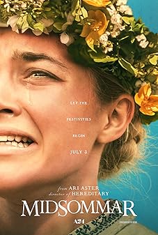
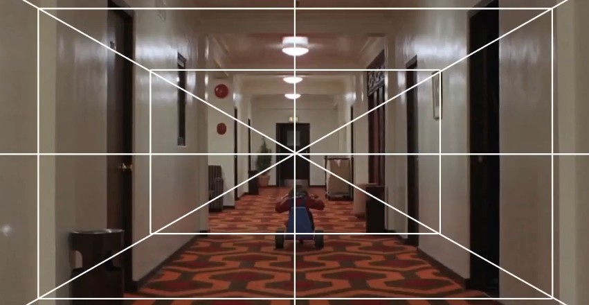
Ari Aster's Symmetrical Horror
Aster — working primarily with cinematographer Pawel Pogorzelski — uses symmetry in horror in a way that inverts its conventional association with comfort and resolution. Perfect symmetry usually reads as control, stability, and order. In Hereditary and Midsommar, perfect symmetry reads as dread — the too-orderly frame signals a world under sinister control, a universe arranged by forces the characters cannot see. The pagan ritual circles, the perfectly centered family dinner tables, the symmetrical grief compositions — all carry a doubled meaning: they are beautiful and horrifying simultaneously, composed with care and populated with darkness. The lesson is that compositional conventions carry assumed meanings that can be weaponized by placing inappropriate content within appropriate forms — the horror of Aster's symmetry is precisely that such beautiful composition contains such terrible things.
Practical Exercises
Compositional ability is a perceptual skill — it develops through practice, not through conceptual understanding alone. You can read every principle in this guide and still compose frames intuitively based on habit rather than intention. The exercises below are designed to build compositional perception into your automatic visual vocabulary, so that compositional choices emerge from trained instinct rather than labored analysis. These are not one-time activities — they are practice formats that reward repetition, variation, and progressive challenge.
Daily Composition Studies
Set aside fifteen minutes per day to analyze one still frame from a film, photograph, or illustration you admire. The analysis is not about writing — it is about looking. Identify: where does your eye enter the frame? Where does it travel? Where does it rest? What compositional elements direct each movement? What is in the frame that you initially didn't notice? What creates the dominant mood, and what compositional element is most responsible for it? Do this every day for thirty days, and the perceptual patterns that define excellent composition will become part of your visual vocabulary — accessible in your own work not as rules to be consciously applied but as intuitions you trust. Keep a running file of analyzed frames with brief notations; the accumulation becomes a personal reference library.
Thumbnail Exploration Techniques
Before committing to a composition, generate rapid thumbnail sketches — small, rough, quick — of multiple compositional approaches to the same content. The thumbnail must be small: no more than a few centimeters. The goal is not accuracy but spatial relationships: where are the masses? Where is the light and dark? Where is the subject in the frame? Generating five to ten thumbnails for each composition, each exploring a different approach, breaks the habit of committing to the first idea that emerges. Often the most interesting composition is not the first intuitive one but the third or fourth — after the obvious approaches have been explored and discarded. Thumbnail work is the compositional equivalent of brainstorming: quantity and variation before quality and commitment.
Composition Correction Workshops
Take a collection of your own previous compositions — storyboard frames, illustrations, photographs — and spend a session not on creating new work but on diagnosing and improving existing work. For each frame, identify the compositional weakness: is the subject too centered? Are all elements the same size? Is the tonal contrast insufficient? Is the frame too crowded or too sparse? Then produce a corrected version — same subject, same story moment, different compositional choice. This correction practice is more valuable than new creation practice because it forces explicit articulation of the compositional problem, which builds diagnostic vocabulary. Over time, you will start catching the same problems before they occur in new work, which is how intuitive compositional competence develops.
Building Your Compositional Vocabulary
Maintain a personal visual reference library: not of images you like aesthetically but of images that solve specific compositional problems exceptionally. Organize by technique — not by subject, mood, or style. A folder of exceptional uses of negative space. A folder of powerful diagonal compositions. A folder of memorable group arrangements. A folder of lighting and shadow compositions. This vocabulary library serves two functions: it gives you a resource to consult when you're facing a specific compositional challenge, and it trains your eye over time by exposing it repeatedly to high-quality solutions. Reference is not copying — it is education. Every master of visual composition has internalized a vast library of solved problems; building your own library consciously is simply making explicit what more experienced practitioners do automatically.
From Storyboard to Final Frame
Compositional decisions made at the storyboard stage set the intention for everything that follows in production. But the path from storyboard composition to final frame is not a straight line — it passes through director interpretation, location scouting, production design, cinematography, performance, and post-production, each of which introduces variables that can support or undermine the original compositional intent. Understanding this journey allows storyboarders, directors, and visual planners to design compositions that are both visually precise and practically achievable.
Maintaining Compositional Intent Through Production
The storyboard is a compositional contract — it communicates spatial intent across the production team. But it is only as effective as the communication system around it. A storyboard frame that clearly indicates a low-angle composition, a specific depth relationship between foreground and background elements, and a particular light direction — and that is accompanied by notes explaining why these choices matter to the story — is far more likely to survive the production process intact than one that shows the image without the reasoning. Cinematographers and directors of photography need to understand not just what the frame should look like but why — so that when practical constraints force adaptation, they can honor the intent even when they cannot honor the exact image.
Working with Cinematographers
The relationship between the visual planner — whether a storyboard artist, a director, or a production designer — and the cinematographer is fundamentally a conversation about composition. The cinematographer brings deep expertise in what the camera can and cannot do: lens choices that expand or compress space, lighting setups that take time and resources, practical considerations that make certain compositions more or less achievable on any given day. The most productive collaboration is one in which the compositional intent is stated clearly — "this frame needs to feel oppressive; the character should have no visual breathing room" — and the cinematographer proposes the technical approach to achieve it. Intent drives the creative conversation; technique serves it.
Adapting to Location Limitations
Locations are never identical to what the storyboard imagined. Ceilings are too low, walls are in the wrong place, the light comes from the wrong direction, the available depth is half what the composition requires. The ability to adapt a composition to a real location without losing its essential intent is one of the most important practical skills in visual production. This requires knowing which elements of a composition are essential — the spatial relationship between subject and background, the light direction, the frame height — and which are flexible. A composition designed for a tall, open space can often be preserved in a small, closed one if the essential depth relationship and light direction are maintained, even if every other detail of the original frame is different.
Post-Production Reframing Options
Digital intermediate processes, VFX, and nondestructive editing have created a post-production reframing toolkit that didn't exist for most of cinema history. A 4K or 6K acquisition allows significant reframing in a 2K or 1080p delivery — subjects can be moved within the frame, aspect ratios can be adjusted, and compositional errors can be partially corrected after the fact. This changes the relationship between storyboard composition and final frame: the storyboard is now describing a target rather than a fixed outcome. This is both a liberation and a risk. The liberation is practical flexibility; the risk is that post-production reframing becomes a substitute for compositional thinking rather than a refinement of it. The most effective use of post-production composition tools is not to fix problems but to perfect intentions — to take a composition that was 90% right at acquisition and bring it to 100% in post.